


Pulse Stat of the Week
64% of Americans have little to no trust in companies.
2025 Global Eco Pulse® (US Only)
Accessibility Isn’t Scary. Leaving People Out Is.
Haunted houses are designed to create a sense of disorientation.
Dim lighting, unexpected turns, hidden doors and sudden surprises make it harder to find your way. The experience can vary dramatically from person to person depending on what cues they notice, what information they have available, and how they navigate the space.
Digital accessibility challenges can create a surprisingly similar experience.
People access information in different ways and through a variety of technologies, devices, and methods of interaction. When content isn't designed with those differences in mind, communication gaps can emerge even when the intent was to communicate clearly.
Digital accessibility is about more than making content available. It's about ensuring people can find, understand, navigate and engage with information, regardless of how they access it. When that doesn't happen, what the creator intends and the user encounters can be very different.
Designers see polished layouts. Writers see complete stories. Communicators see carefully crafted reports, websites, and campaigns. Yet some people may encounter challenges that content creators never see. A chart may become difficult to interpret. A document may lose its navigational structure. An image may disappear entirely.
That's what makes accessibility so challenging. Some of the biggest barriers only become apparent when viewed through someone else's experience.
When accessibility is overlooked, people can be left in the dark, unable to find information, move through content, or fully engage with the story being told.
Accessibility Is More Than Compliance
Accessibility is often discussed in terms of regulations, audits, remediation, and compliance requirements. Standards such as the Web Content Accessibility Guidelines (WCAG) provide a framework for creating digital content that can be accessed, understood, and used by more people.
But reducing accessibility to a checklist misses the bigger picture.
At its core, accessibility is about communication.
Availability alone isn't enough. Content needs to be understandable, navigable and usable.
Can people find what they need? Understand it? Navigate it? Engage with it?
Those questions sit at the heart of both accessibility and effective communication.
If people cannot find, navigate, understand or engage with your content, your message is not reaching its intended audience. For communicators, that's the real issue. Accessibility is not simply a technical requirement. It's a measure of whether communication is actually working.
Ten years ago, accessibility was often viewed as a specialized requirement. Today, it has become an expectation. We've seen it move from technical teams into procurement requirements, reporting programs, website standards and communications RFPs.
That's because accessibility is no longer viewed solely as a compliance issue. It's also a measure of whether communication is reaching and engaging the people it was designed for.
Accessibility Is Where Inclusion Moves from Intent to Experience
Many companies publicly communicate commitments related to inclusion, accessibility, employee experience, human rights, stakeholder engagement and creating opportunities for people to fully participate in the workplace and society.
But those commitments are only meaningful if people can find, understand, and engage with the information being shared.
Making sustainability reports, websites and digital communications accessible is one way companies can demonstrate those commitments in practice, not just in principle.
For sustainability communications in particular, the intended audience is broad. Employees, investors, customers, communities, regulators, NGOs and prospective talent all interact with reports, websites and digital content in different ways.
Accessibility helps ensure that the information companies work so hard to produce can be found, understood, and experienced by the audiences they are trying to reach.
Whether it's a sustainability report, website, campaign or social content, the goal is the same: to help stakeholders understand a company's commitments, progress and impact. If portions of the audience cannot easily access that information, a gap emerges between what companies intend to communicate and what stakeholders actually experience.
Accessibility helps close that gap.
It's one way inclusion moves from intent to experience.
Viewed through that lens, accessibility is not just about accommodating different needs. It is about ensuring information reaches people in a way they can fully engage with.
Accessibility, Discoverability and AI
At ERM MCA, we’ve explored how artificial intelligence is reshaping the way sustainability information is discovered and understood in previous articles, including:
- Your reputation is now an AI answer: managing trust, risk and sustainability in the age of generative search
- If AI can’t find your sustainability story, does it exist?
- AI search is a competitive advantage for sustainability-minded companies — but only if they act quickly
A common theme across those conversations is that content needs structure, context, clarity and meaning to be understood.
Companies are investing significant time in understanding how AI systems discover, summarize and interpret content. Ironically, many of the practices now associated with AI readiness have long been foundational accessibility practices.
The heading structure that helps a screen reader navigate a report can also help AI understand relationships between topics. Alt Text provides context for users who cannot see an image while helping machines better interpret visual content. Meaningful labels, descriptive links and logical information architecture improve understanding for both people and technology.
In other words, accessibility helps people access content. The same principles help machines understand it, too.
That doesn’t diminish the importance of accessibility’s primary purpose. Rather, it reinforces a broader truth: content that is easier to understand is simply better communication.
From Trick to Treat
The good news?
Many of the most impactful accessibility improvements are also among the easiest to address. Here are five common barriers that often go unnoticed, along with the tricks to avoid and treats to embrace.
1. Information Disappearing Into the Fog
Color Contrast
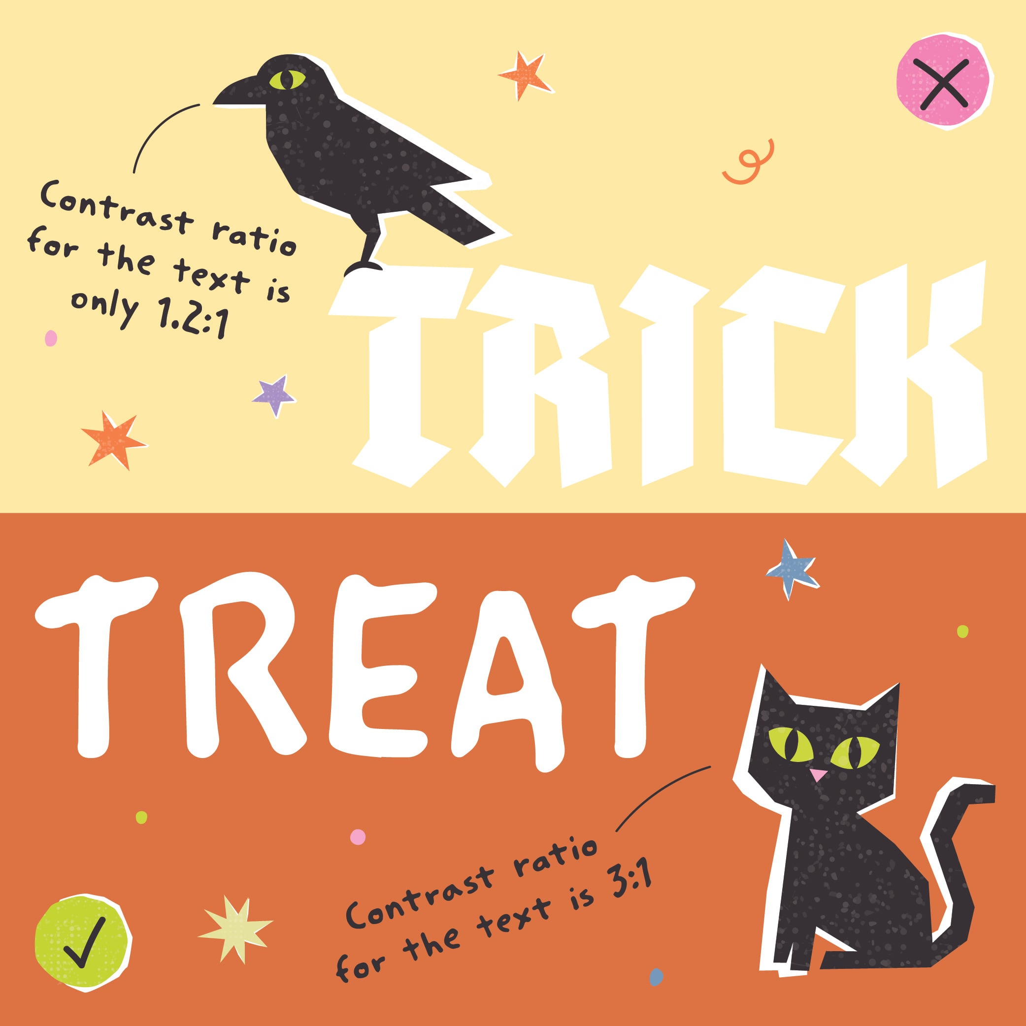
Trick
Using low-contrast colors or relying solely on color to communicate meaning.
Examples include:
- Light gray text on a white background
- Charts that use color alone to distinguish categories
- Graphics where important information disappears when color perception changes
What Some Users Experience
Text becomes harder to read.
Data becomes harder to interpret.
Key messages become harder to identify.
Treat
Use sufficient color contrast and reinforce meaning with additional visual cues.
Examples include:
- Labels
- Patterns
- Icons
- Direct annotations
- Data markers
Why It Matters
If meaning disappears when color is removed, the message may already be disappearing for part of your audience.
2. When Important Information Becomes a Ghost
Alternative Text (Alt Text)
Trick
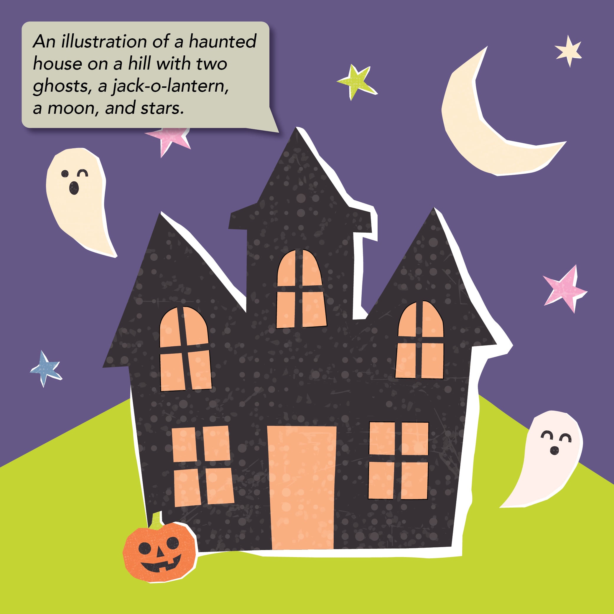
Publishing images, charts, diagrams and infographics without meaningful Alt Text. Or describing what something looks like without providing the context needed to understand why it's included.
What Some Users Experience
A gap in the story.
Important context and insight simply disappear.
Treat
Describe the purpose of the visual in the context of the content.
Good Alt Text answers an important question:
What does the reader need to understand from this image?
For photographs and illustrative images, that often means describing the relevant content, action, setting or details that help the image contribute to the story.
For charts, graphs, diagrams and other complex visuals, the focus shifts to communicating the key information, trend or takeaway rather than describing every bar, line or visual element.
Harvard University notes that Alt Text should provide context for how an image relates to the surrounding content, not simply describe every detail shown.
Photo example
Alt Text: Collection bins filled with pumpkins awaiting composting at a community pumpkin recycling event.
Why it works:
- Describes what is happening in the image.
- Provides relevant context.
- Avoids unnecessary interpretation.
Chart example
Alt Text: Bar chart showing annual pumpkin recycling volumes increasing from 2022 to 2026, with more than twice as many pumpkins recycled in 2026 compared to 2022.
Why it works:
- Communicates the key trend rather than describing every visual detail.
- Helps users understand the most important information quickly.
Why It Matters
The goal isn’t to turn Alt Text into a messaging vehicle. It’s to ensure people receive the same meaningful information conveyed through the visual. If an image or graphic carries part of the story, that story shouldn’t disappear when the visual does.
3. Every Document Needs a Skeleton
Structure and Headings
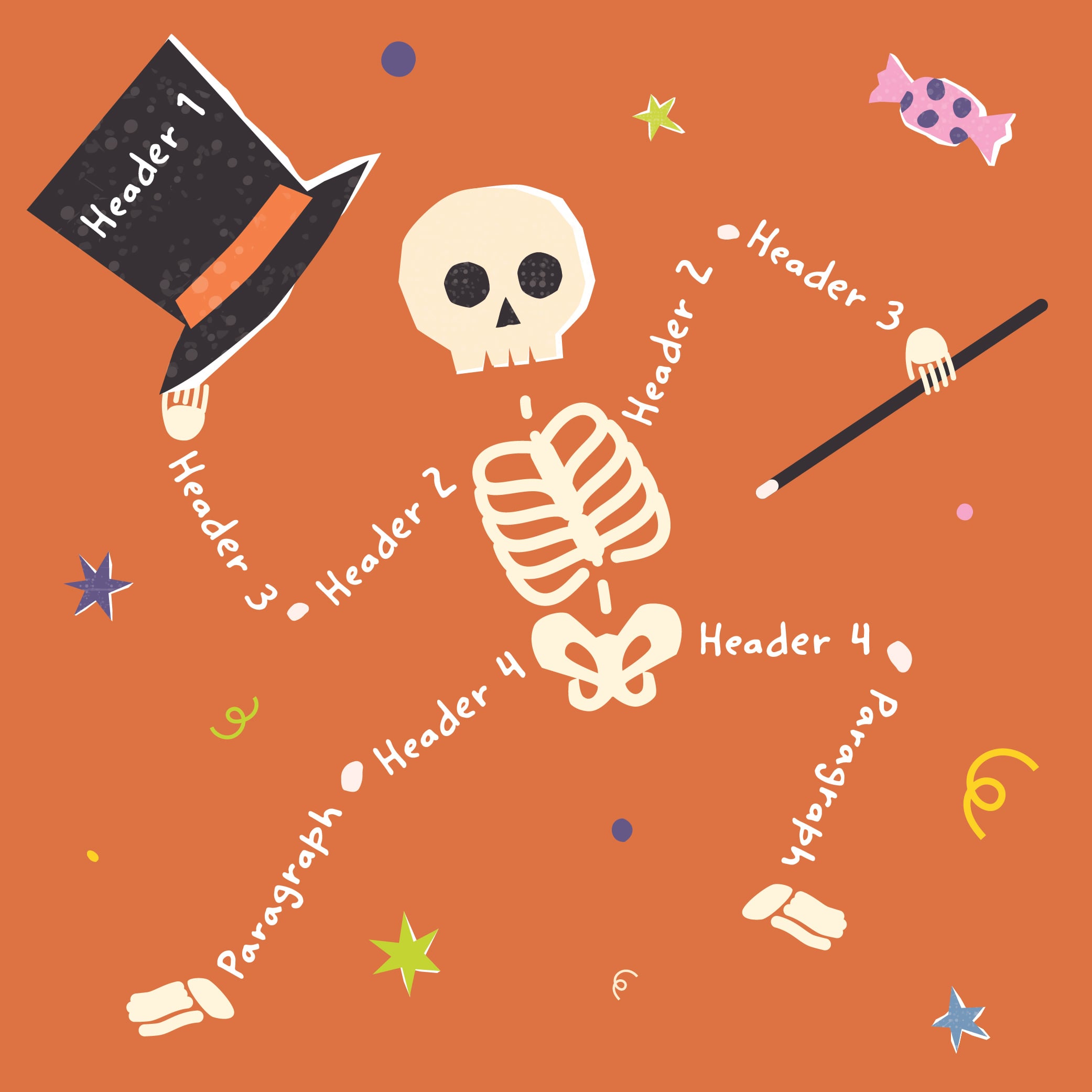
Trick
Creating visual organization without actual document structure.
Examples include:
- Bold text used as a heading
- Skipped heading levels
- Inconsistent heading hierarchy
- Unclear flow of information
What Some Users Experience
A document without a map.
Finding information becomes more difficult because the structure behind the content is missing.
Treat
Build a strong document skeleton.
Use:
- Proper heading levels
- Logical hierarchy
- Consistent structure
- A clear flow of information
Why It Matters
Structure helps users understand:
- Where they are
- What’s important
- Where to go next
It also helps search engines, assistive technologies, and AI systems better understand how information is organized and connected.
After all, every haunted house has a skeleton. Every accessible document should too.
4. Beware of Dead Ends
Links
Trick
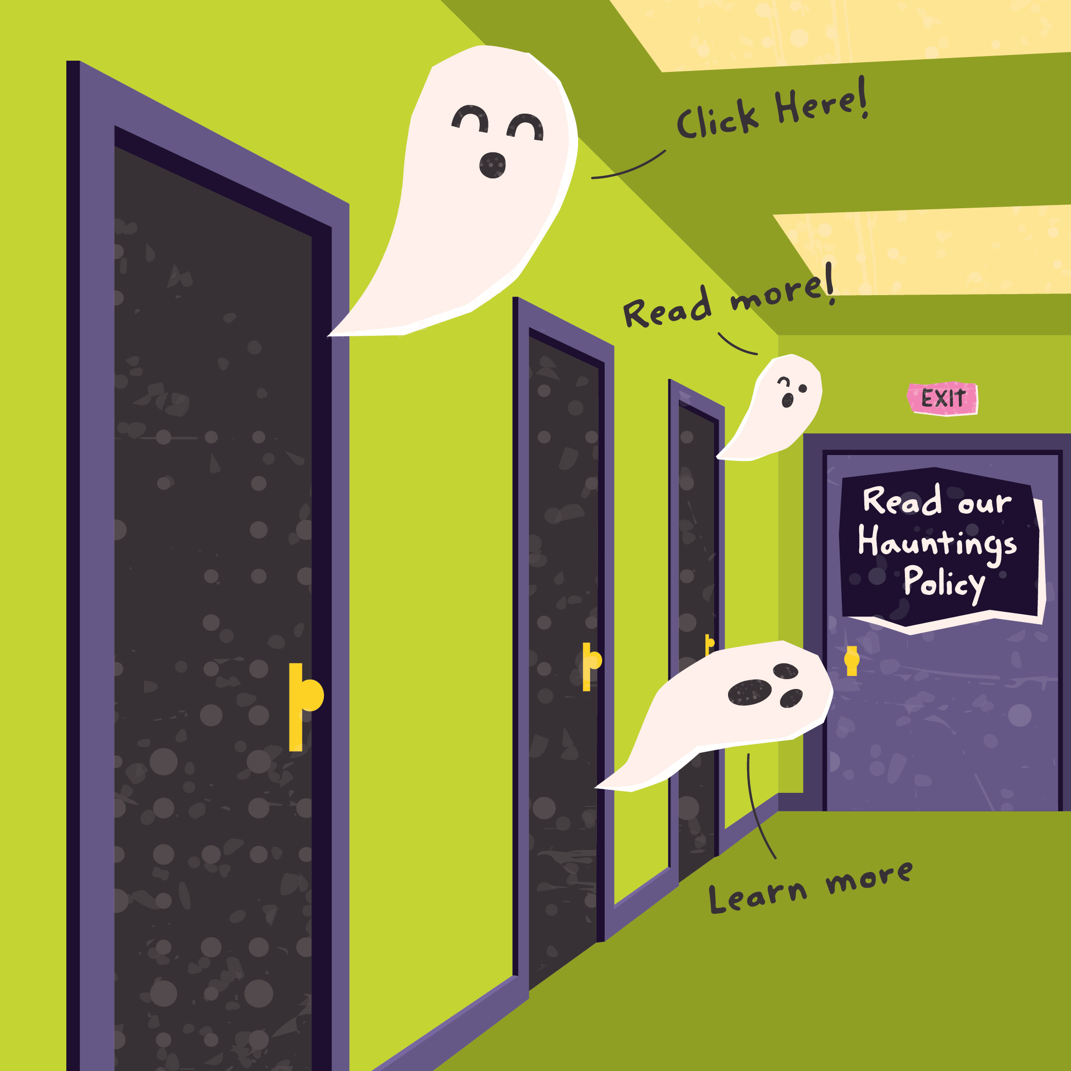
Using vague or unhelpful link text such as:
- Click here
- Learn more
- Read more
Or displaying long URLs that provide little context about where a link leads:
https://www.companyname.com/corporate/sustainability/reports/esg-report-2026-final-version.pdf
What Some Users Experience
A hallway full of identical doors.
There is no indication where any of them lead.
Treat
Write descriptive links that clearly communicate destination and purpose.
Instead of:
❌ Click here
Try:
✅ Download the 2026 Sustainability Report
✅ View the Climate Transition Plan
✅ Read the Human Rights Policy
Why It Matters
Users should understand where a link leads before selecting it.
Descriptive links improve navigation, usability and overall comprehension. They also provide context for assistive technologies, making it easier to understand the purpose of a link without relying on surrounding content.
5. Escaping the Data Maze
Tables
Trick
Creating overly complicated tables that rely on:
- Merged cells
- Blank cells
- Inconsistent structures
- Complex navigation paths
What Some Users Experience
A maze of disconnected information.
Relationships between data points become difficult to follow and interpret.
Treat
Keep tables simple, structured, and logical.
Use:
- Clear header rows
- Consistent organization
- Logical relationships
- Appropriate use of tabular data
- Avoid unnecessary merged and blank cells whenever possible.
Why It Matters
Tables should guide users to insights, not force them to solve a puzzle.
Data only creates value when people can access and understand it.
No Tricks. Just Better Communication.
Perhaps the biggest misconception about accessibility is that it only benefits a relatively small audience.
In reality, accessibility improves communication for everyone.
It supports inclusion. It improves usability. It strengthens stakeholder engagement. It reduces barriers to information. It also helps make content easier for search engines to discover and AI systems to interpret.
The scariest accessibility barriers are often the ones content creators never see.
But they’re very real to the people experiencing them.
The companies that communicate most effectively aren’t necessarily producing the most content. They’re the ones ensuring that content can be found, navigated, understood, and put to use by the people it was created to serve.
Accessibility works best when considered from the start, woven into planning, content development, design and user experience decisions before small barriers become larger challenges.
It is one of the clearest ways to ensure that the messages companies work so hard to create can actually be received, understood and experienced as intended.
Accessibility isn’t scary. Leaving people out is.
Want to see if we’re a match?
No matter where your company is on its journey, whether it’s just getting started or looking for new and bolder stories to tell, we can help.